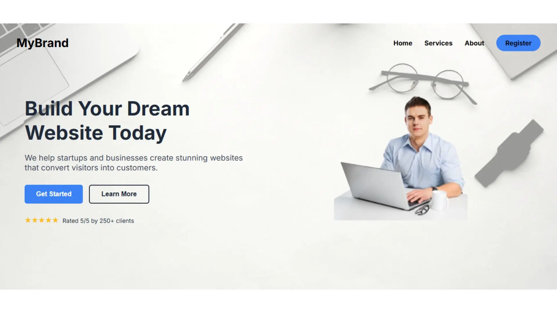
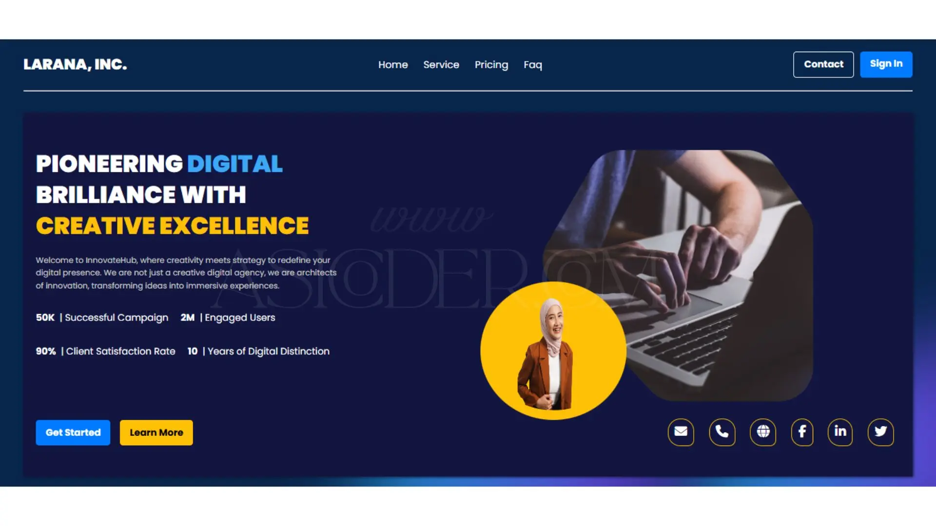
A Hero Section is the prominent banner-like area at the top of a webpage, often containing a headline, subheading, call-to-action button, and an eye-catching image or video. It is important because it’s the first thing visitors see, helping capture attention, communicate the main message, and guide users toward desired actions right from the start.
Yes, a Hero Section can be enhanced with interactive elements such as sliders to showcase multiple messages or visuals, autoplay background videos for a dynamic feel, and hover effects to engage users. These features make the section more visually appealing and can increase user interaction if implemented thoughtfully without overwhelming the visitor.
To optimize for conversions, keep the headline clear and impactful, the subheading informative yet concise, and the call-to-action (CTA) button visually prominent. Use high-quality images or videos relevant to the product or service, and ensure the layout is responsive so it looks appealing across all devices. A/B testing can also help refine messaging and design for better results.
Best practices include using flexible grid systems or CSS frameworks, ensuring that text and CTAs remain legible on all screen sizes, and using optimized images to prevent slow load times. Mobile-first design is key—arranging elements so they stack neatly on smaller screens while still providing a visually balanced layout that delivers the core message effectively.