 Chat with Us
Chat with Us
Chat with Us
1
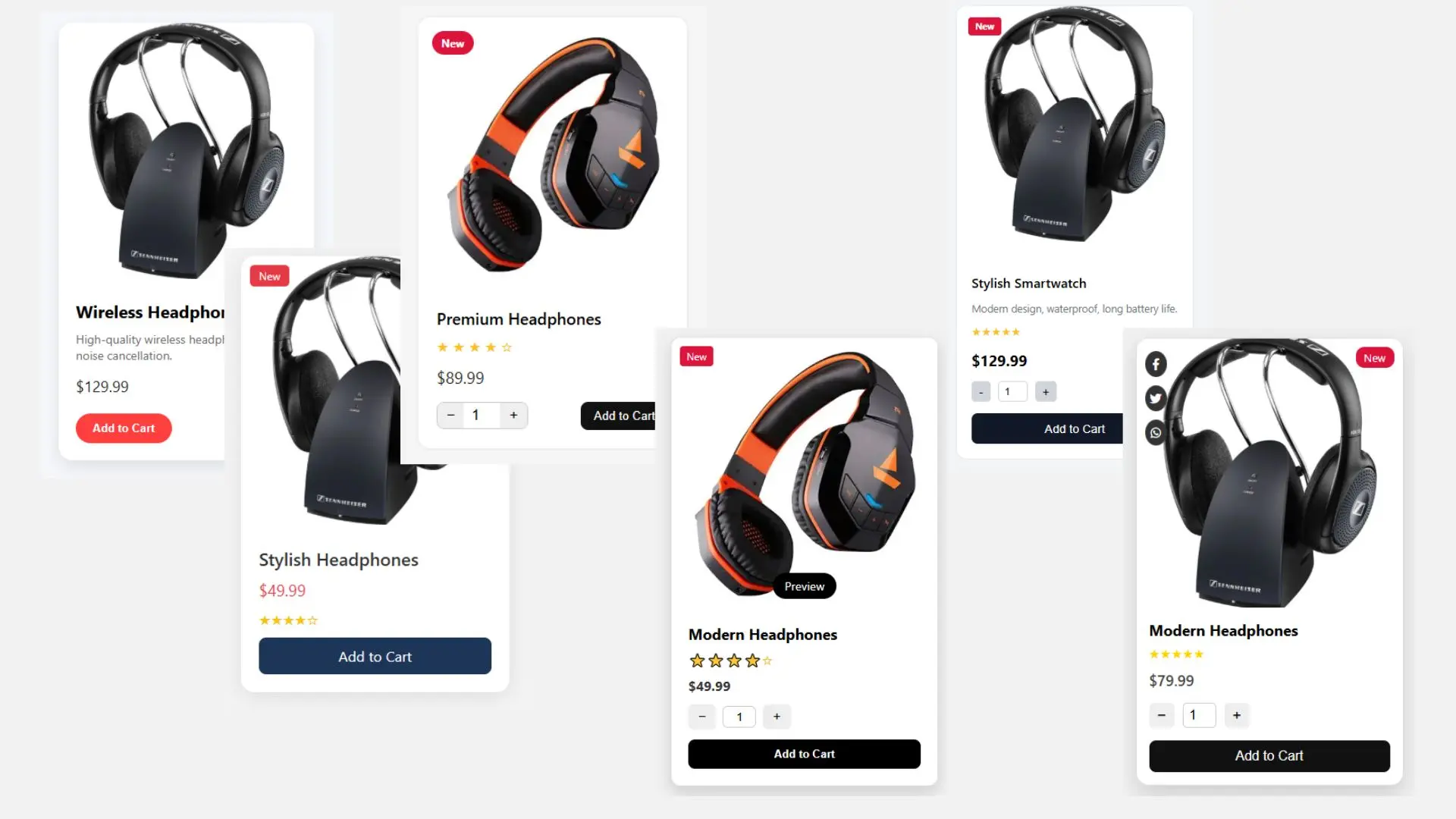
This Product Card Component is a fully responsive and reusable UI element designed to visually display product details in modern web and mobile applications. Built with clean HTML, CSS,Javascript and customizable logic, it offers all essential features needed for an eCommerce or digital product platform.
Key Features:
Product Image Display – Showcase high-resolution images.
Product Name & Short Description – Easily readable and clean layout.
Star Ratings – Show average customer reviews visually.
Quantity Selector – Users can update product quantity before adding to cart.
Add to Cart Button – Direct integration with shopping functionality.
Responsive Design – Perfectly fits all screen sizes from mobile to desktop.
Reusable Component – Can be used multiple times with different data props.
Easily Customizable – Change color, font, size, and icons to match your brand.
eCommerce websites (e.g., Shopify, Laravel, WooCommerce)
Mobile shopping apps (React Native, Flutter, etc.)
Admin panels or dashboards
Digital product listings
Service cards in SaaS platforms
Product bundles or deal sections
Whether you are building a marketplace, an inventory app, or a digital store, this component simplifies product presentation and enhances user interaction.
| Last Update | August 16, 2025 |
| Published | July 31, 2025 |
| Resolution Screen | YES |
| Included Files | HTML | CSS | JAVASCRIPT |
| Support Browsers | ALL |
| Use FrameWork | no framwork |
| Software Version | HTML5, CSS3, Vanilla JavaScript (ES5/ES6) |
| Tags | Product Card | UI Component | Ecommerce UI | Responsive Product Card | Add to Cart | Tailwind CSS Card | Product Display Block | Shopping Cart UI | Reusable Frontend Component | Product Listing UI |
Be the first to know. Subscribe today and unlock exclusive deals!
Working Days / Hours!
Free support line!
Orders Support!

