Find interesting products, stories and categories tailored for you.
Here Documentry write about create item
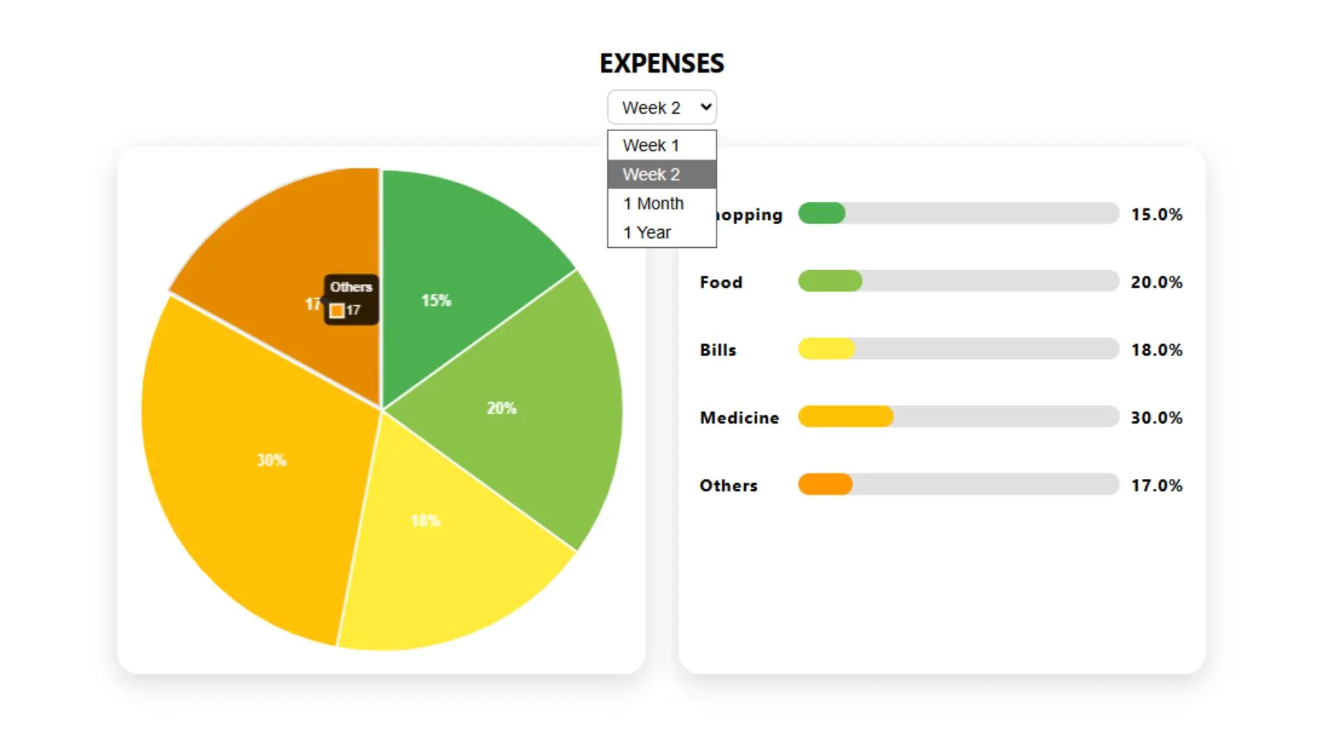
This modern Pie Chart component is crafted using HTML, CSS, JavaScript, and Chart.js with datalabels support. It visually represents categorized data like expenses using an interactive pie chart alongside dynamic horizontal progress bars. The UI is responsive and allows users to switch datasets by time (Week 1, Week 2, 1 Month, 1 Year), making it ideal for financial dashboards, analytics pages, or reports.
Key Features:
Clean, modern 3D-like pie chart visualization
Interactive dataset selector (weekly, monthly, yearly)
Auto-rendering progress bars with accurate percentages
Responsive and mobile-friendly layout
Built with Chart.js and chartjs-plugin-datalabels
Supports dynamic dataset switching via dropdown
Smooth hover effects and animated transitions
Ideal for showcasing categorized statistics like expenses or usage
Use Cases:
Expense tracking dashboards
Financial and budgeting apps
Business or eCommerce analytics sections
SaaS or CRM dashboards
Education or reporting systems (visualizing results, performance, etc.)
Personal finance tools or admin panels

Be the first to know. Subscribe today and unlock exclusive deals!
Working Days / Hours!
Free support line!
Orders Support!

