 Chat with Us
Chat with Us
Chat with Us
Find interesting products, stories and categories tailored for you.
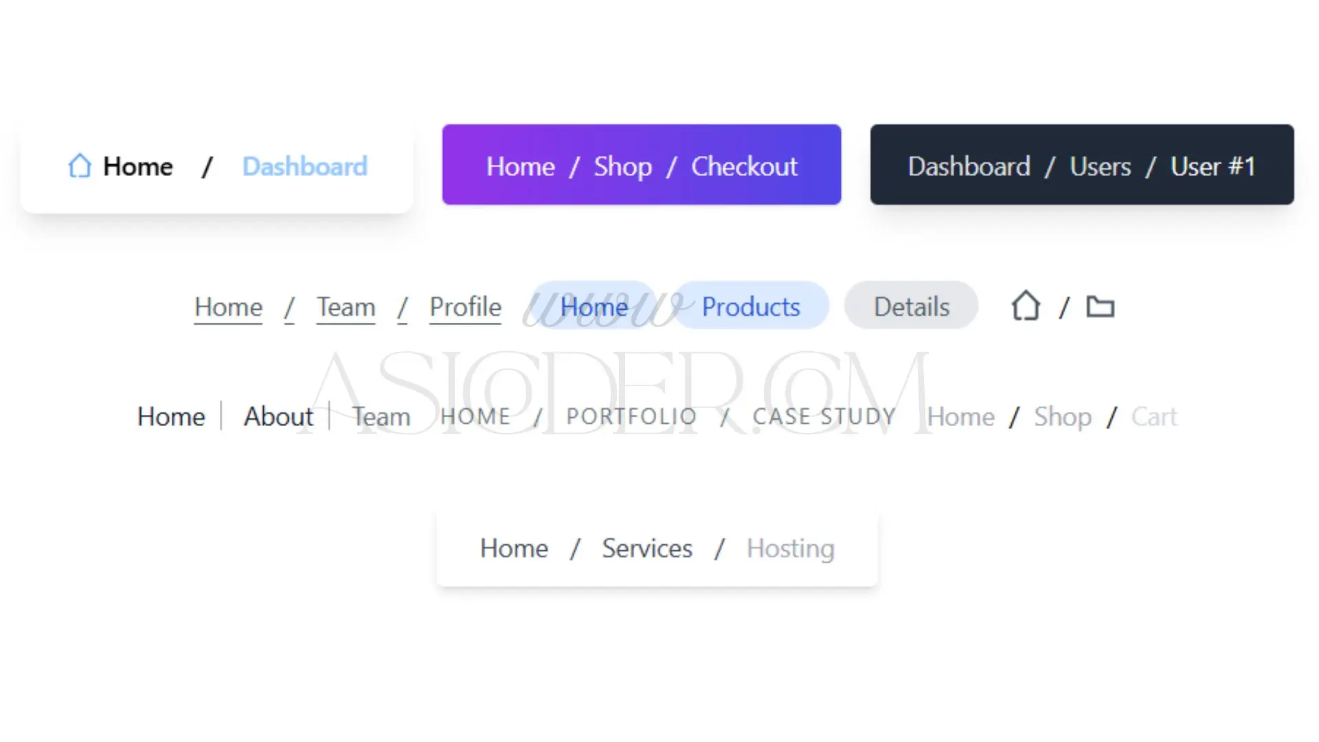
This collection of 10 Modern Breadcrumb Navigation Components is built using Tailwind CSS, offering stylish, user-friendly navigation aids for web applications and websites. Each design emphasizes clarity, aesthetic appeal, and usability, helping users understand their current location and move easily through your site's hierarchy.
From glassmorphism to icon-only, animated hover effects, and pill-shaped styles, these breadcrumbs are ideal for enhancing user experience on dashboards, portfolios, ecommerce platforms, SaaS panels, admin dashboards, or blogs.
All components are:
Fully responsive
Minimalistic & clean
Compatible with all modern browsers
Easy to integrate in any HTML/Tailwind project
Customizable in size, spacing, icons, and color themes
You can use these Breadcrumbs in:
Admin Dashboards
E-commerce Websites
Portfolio Websites
Blogs & CMS
Web Applications
SaaS Platforms
Multi-level Category Pages
Product Pages
Checkout Processes
Documentation Pages
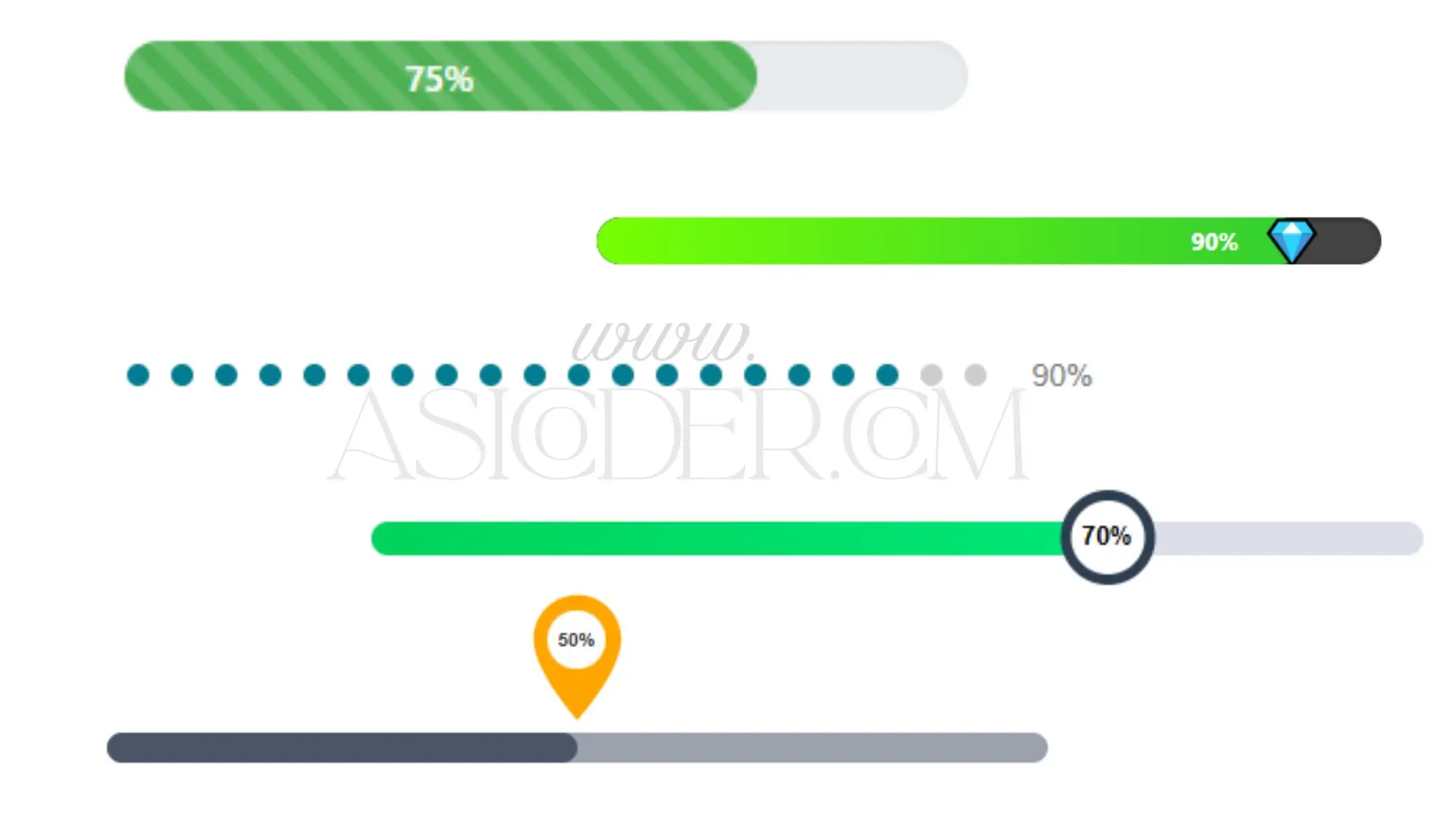
🔹 Overview:
This interactive progress bar seamlessly combines an icon, percentage counter, and a fluid animated fill effect. It’s perfect for visually showcasing skills, task completion rates, or real-time statistics.
🔹 Features:
Icon displayed alongside the animated progress bar
Percentage updates dynamically using JavaScript
Smooth CSS transitions for engaging animation
Fully responsive and adaptable layout
🔹 Ideal For:
Skill sections on personal portfolios
Task tracking or productivity interfaces
Interactive dashboards or reporting tools
🔹 Overview:
A modern and visually refined progress bar built with a clean aesthetic. Balanced colors, spacing, and subtle effects offer a professional touch suitable for business applications.
🔹 Features:
Clean, flat UI design with structured layout
Optional progress labels and percentage indicators
JavaScript-powered progress control for dynamic updates
Responsive across all screen sizes
🔹 Ideal For:
Business dashboards and KPIs
SaaS and corporate platforms
Performance or project tracking interfaces
🔹 Overview:
A visually engaging progress component that uses animated dots instead of traditional bars. Each dot fills progressively, offering a simple yet effective way to track step-based progress.
🔹 Features:
Sequential animation of dots with configurable delay
Customizable dot size, color, and quantity
Smooth CSS-based transitions without external libraries
Lightweight and easy to implement
🔹 Ideal For:
Multi-step onboarding processes
Interactive quizzes and forms
Tutorial walkthroughs and learning modules
🔹 Overview:
A circular progress indicator designed using only HTML, CSS (with gradients or SVG), and JavaScript. This radial progress bar offers a stylish and intuitive way to represent completion levels.
🔹 Features:
Smooth radial fill animation
Optional inner content such as percentage or icon
Fully customizable size, color, and thickness
JavaScript used to update progress dynamically
🔹 Ideal For:
Fitness and goal-tracking applications
Visual analytics components
User performance and score meters
🔹 Overview:
An innovative progress component that mimics a pin drop or marker moving along a track. Designed for interactive storytelling or stage-based flows, this UI element stands out visually.
🔹 Features:
CSS-based animation for pin/marker movement
Supports horizontal and vertical track orientation
Progress labels or milestones along the path
Fully responsive and easily styled
🔹 Ideal For:
Delivery or shipment tracking interfaces
Career or educational journey visualizations
Project roadmaps and timeline components
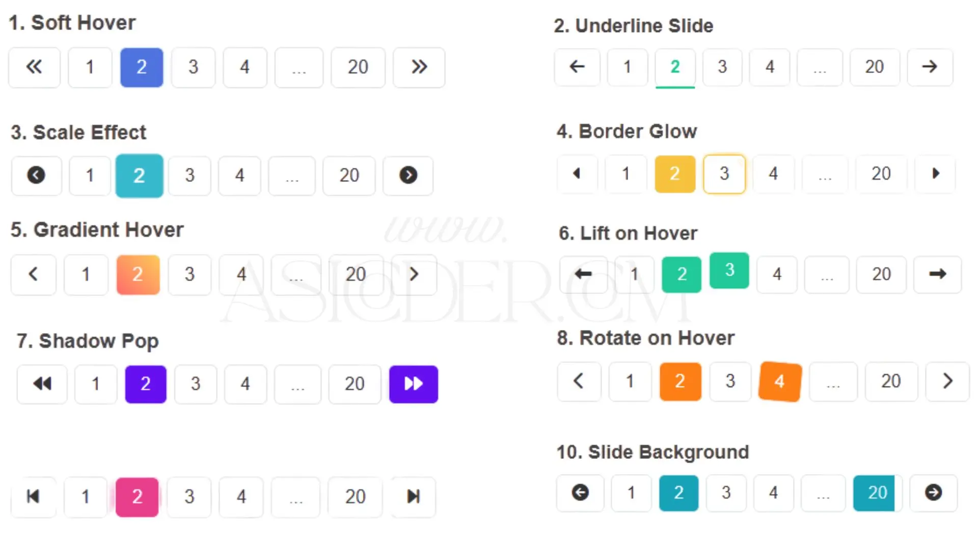
Enhance your website navigation with the Ultimate Pagination UI Collection — a set of 10 unique and trending pagination designs built using HTML, CSS, and JavaScript. Each design is lightweight, responsive, and easy to integrate into any website or web app.
This collection includes:
Modern Sliding Pagination – Smooth animated slide transitions for page numbers.
Minimalist Number Pagination – Clean, simple number-based navigation for professional layouts.
Gradient Animated Pagination – Eye-catching gradient backgrounds with hover animations.
Circle Pagination – Rounded navigation buttons for a stylish, modern touch.
Icon Pagination – Navigation using icons for a unique user experience.
Floating Pagination – Stays visible while scrolling, with soft shadow effects.
Bold Highlight Pagination – High-contrast design for maximum visibility.
Hover Zoom Pagination – Buttons enlarge smoothly on hover for interactivity.
Dot Style Pagination – Minimal dots for sliders, carousels, and galleries.
Glassmorphism Pagination – Elegant blurred-glass effect for cutting-edge UIs.
Perfect for blogs, portfolios, e-commerce stores, admin dashboards, image galleries, and creative websites, this set helps you create a navigation experience that is modern, intuitive, and visually engaging without relying on external libraries.
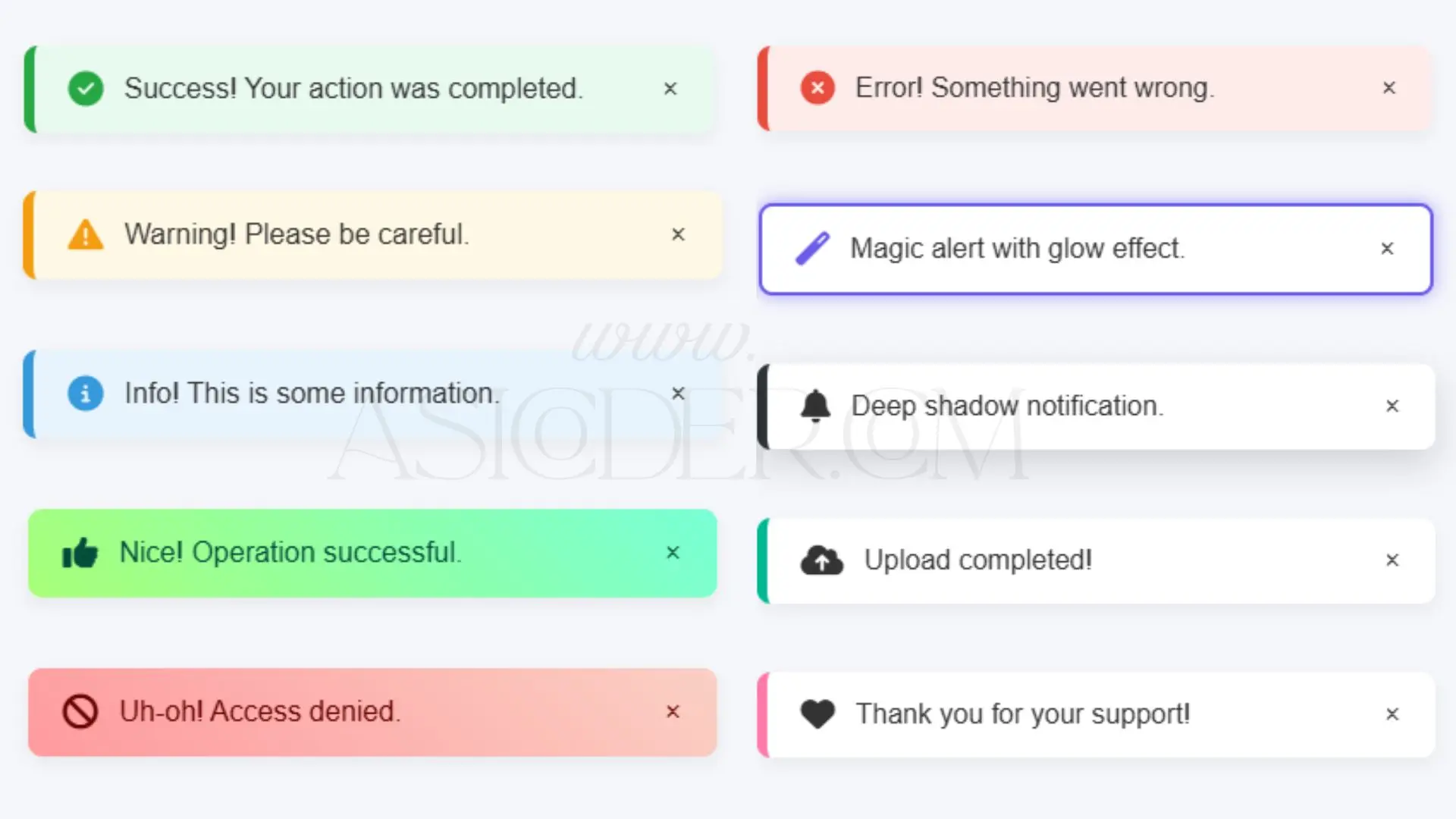
Upgrade your website's user interaction with this Modern Alerts Collection — a set of 10 unique and animated alert notification designs crafted using HTML, CSS, and JavaScript.
Each alert type is visually distinctive, featuring smooth animations, eye-catching icons, and modern UI styling to deliver messages effectively.
Included alert styles:
Success Alert – Clean green success style with icon and smooth slide-in.
Error Alert – Bold red error notification for immediate attention.
Warning Alert – Bright warning style for important cautions.
Info Alert – Cool blue information bar for general updates.
Gradient Success & Error – Stylish gradient backgrounds for modern designs.
Glow Alert – Magical glow border effect for premium look.
Deep Shadow Alert – Strong shadow styling for depth.
Floating Alert – Animated floating entry for dynamic feel.
Slide Right Alert – Smooth horizontal slide-in for engaging UX.
Features:
Smooth animations (slide, float, zoom)
Fully responsive design
Font Awesome icons included
Easy close button with fade-out effect
Lightweight and library-free
Perfect for portfolios, dashboards, blogs, e-commerce stores, and web apps, these alerts help improve user feedback, error handling, and interactive communication without sacrificing design quality.
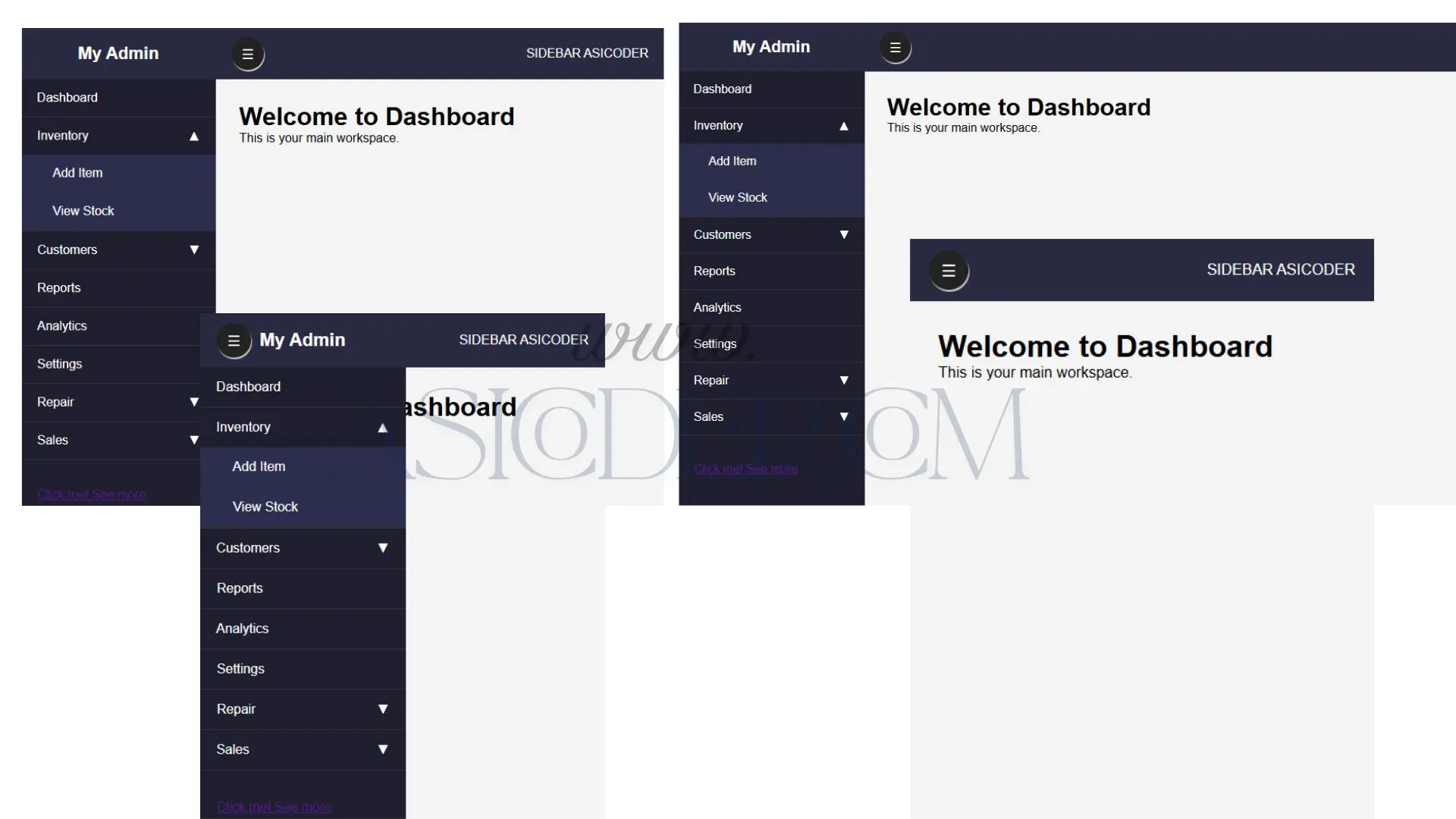
This Admin Dashboard Sidebar is a sleek and responsive navigation component designed to simplify management of inventory, customers, sales, and repairs. Built with usability and clarity in mind, it offers smooth submenu toggles and intuitive navigation, perfect for modern admin panels, SaaS dashboards, and web applications.
Features include:
Fully responsive layout adaptable to all screen sizes
Clear section separation for Inventory, Sales, Customers, Repair, and more
Easy to customize colors and styles
Lightweight with smooth toggle animations for submenus
Compatible across modern browsers
Ideal for enhancing admin user experience and productivity
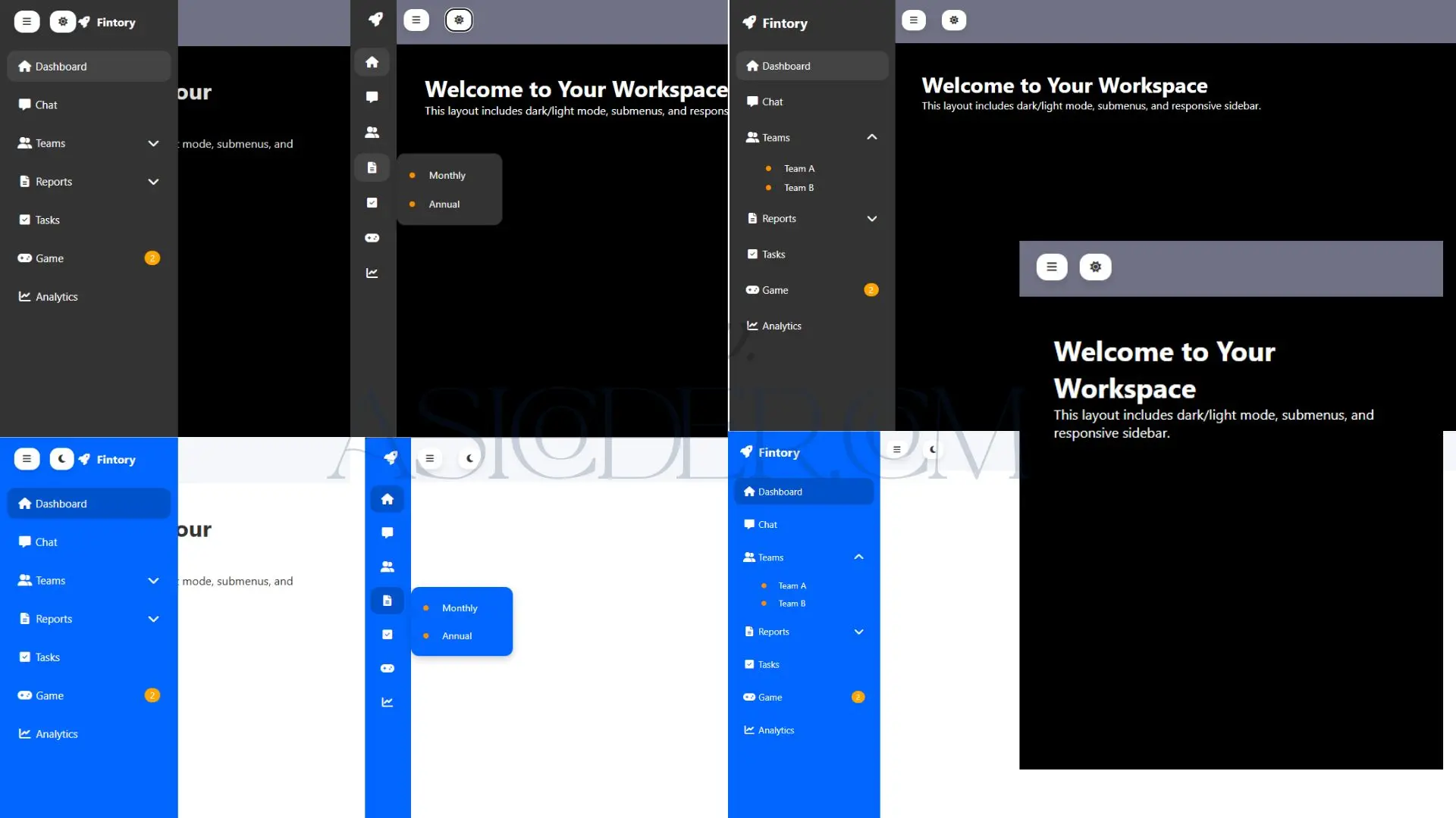
This Modern & Responsive Sidebar Navigation component offers an elegant solution for web apps and admin dashboards, combining functionality with aesthetic appeal. It features responsive layout, collapsible sidebar, smooth submenu animations, and seamless theme switching between dark and light modes. Designed for clarity and ease of use, it helps users navigate complex interfaces effortlessly.
Ideal for SaaS platforms, admin panels, portfolios, and any web app requiring efficient sidebar navigation with theme flexibility.
Key features:
Fully responsive & collapsible sidebar
Smooth submenu toggling with animation
Dark and light mode support
User-friendly design with icons and badges
Compatible with all modern browsers
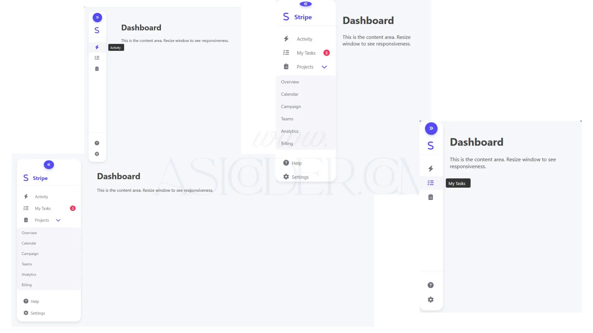
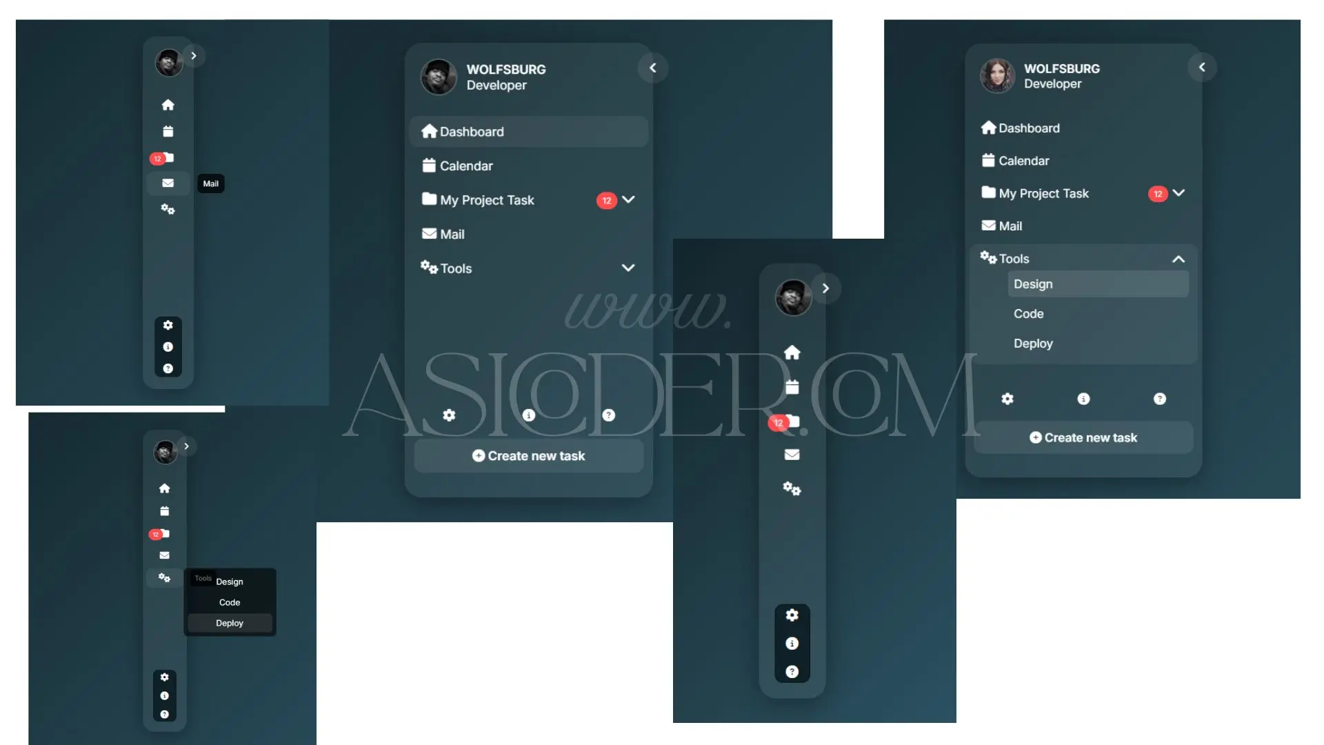
This Modern Stripe Style Sidebar Navigation component offers a clean, minimalist design inspired by Stripe’s UI aesthetic. It includes responsive expand/collapse behavior, submenu toggling with smooth animations, and handy tooltips for better usability when collapsed.
Designed for modern web apps, admin dashboards, and SaaS platforms, it ensures an intuitive navigation experience with accessible ARIA attributes and keyboard support. The sidebar uses subtle shadows, rounded corners, and vibrant accent colors to create a visually appealing and user-friendly interface.
Features:
Responsive sidebar with smooth expand and collapse toggle
Submenu with animated open/close and hover interaction
Tooltips for collapsed sidebar menu items for clarity
Accessible with ARIA roles and keyboard navigation support
Stylish badges for notifications or counts
Clean, modern design inspired by Stripe UI
This component is perfect for developers looking to implement a professional sidebar navigation with minimal setup and maximum UX impact.
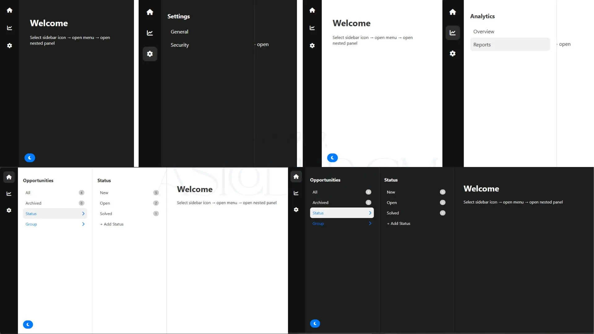
This Advanced Sidebar UI component offers a sleek vertical navigation with collapsible icons that reveal detailed submenu and nested panels. It supports multiple layers of navigation for complex apps, providing users an efficient way to browse through opportunities, analytics, and settings.
With a built-in dark and light theme toggle, this sidebar adapts to user preferences, enhancing accessibility and visual comfort. The design features smooth transitions, hover effects, and counters (badges) to display item counts dynamically.
Ideal for building modern admin dashboards, SaaS applications, and professional web interfaces, this sidebar ensures a clean user experience with minimal clutter.
Features:
Collapsible sidebar with icon-only mode
Nested submenu and subsubmenu panels for multi-level navigation
Dark and light theme toggle button
Hover and active state highlighting
Responsive layout suitable for desktops and tablets
Simple, minimalistic design with smooth animations
This Modern Glass Sidebar UI component offers a sophisticated navigation panel with a translucent glass effect, elegantly blending into any app’s background. It supports both hover-triggered and click-based submenu toggling for flexible user interaction. The sidebar collapses and expands smoothly with animated icons and clear visual cues.
Ideal for admin dashboards, project management tools, and productivity apps, this sidebar enhances UX with its clean design, intuitive navigation, and responsive layout. Features include badges for notifications, profile display, and a dynamic toggle button, all styled with modern CSS glassmorphism techniques.
Key Features:
Glass-style translucent sidebar with blur effect
Smooth toggle between collapsed and expanded states
Hover and click interactions to reveal nested submenus
Notification badges to highlight active items
Responsive and accessible UI for all devices
Profile info display on sidebar expansion
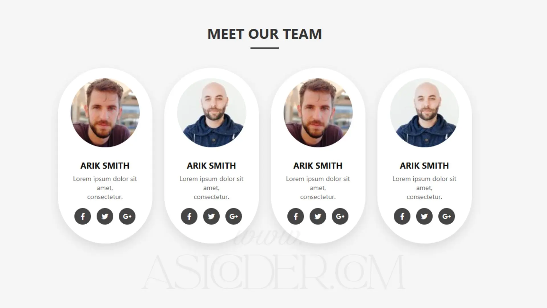
This Meet Our Team component provides a clean and responsive way to introduce your staff, team members, or contributors on your website. Each profile card includes:
Circular profile images
Name and role/short bio
Social media links with hover effects
Modern card design with shadows and animations
It’s ideal for About Us pages, company websites, agency portfolios, personal branding sites, and team showcase sections. Designed with HTML & CSS only, this component works across all devices and browsers.
Features:
Fully responsive layout (desktop, tablet, mobile)
Circular profile pictures with smooth hover animation
Social media icons for quick connection
Minimal & professional card design
Easy to customize colors, fonts, and spacing
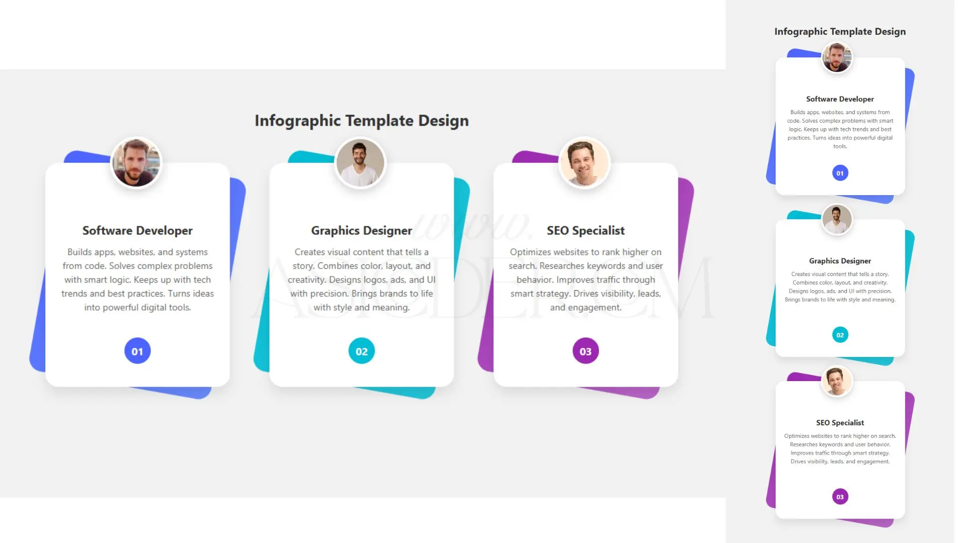
This Responsive Team Profile Cards component provides a visually engaging testimonial-style layout with staggered gradient backdrops, circular profile images, concise role descriptions, and numbered badges for order emphasis. It is perfect for team showcase sections, client testimonials, or highlight features on agency and corporate websites.
Highlights:
Vibrant gradient backgrounds with rotated card layering
Smooth hover effect elevating the card
Circular avatar with shadow for visual depth
Role title, description, and numbering for structured storytelling
Fully responsive across desktop, tablet, and mobile devices
Easy to tweak colors, fonts, and layout for brand alignment
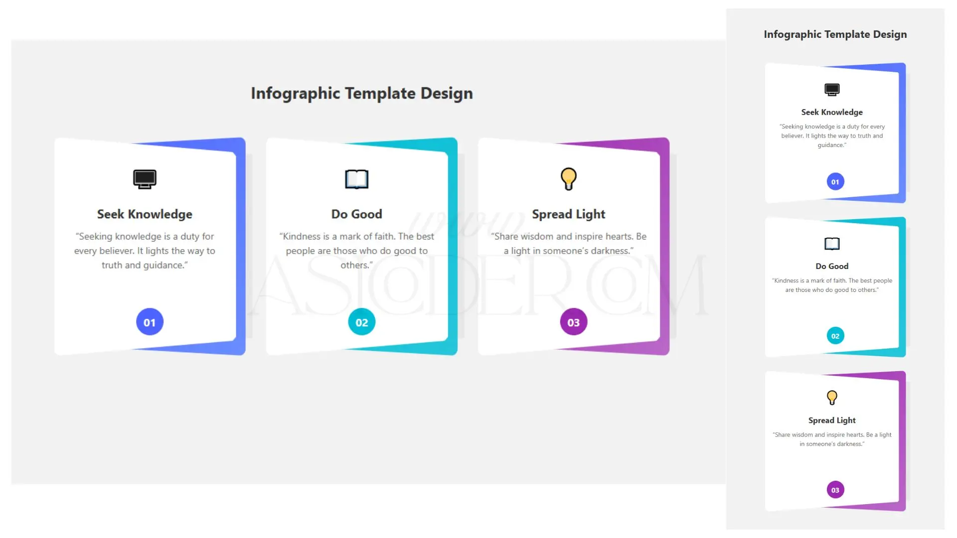
This Layered Infographic Cards component features a modern, angled-card design with gradient backgrounds, shadow layering, and engaging hover animations. Each card includes an icon, title, inspirational quote, and numbered badge for sequencing. Perfect for educational sites, motivational blogs, Islamic quote showcases, or portfolio infographics.
Highlights:
Unique layered & clipped card design
Vibrant gradient backgrounds with subtle shadows
Numbered badges for step-by-step or ordered content
Responsive and mobile-friendly
Customizable colors, icons, and text for various themes
Smooth hover animations for interactivity
Be the first to know. Subscribe today and unlock exclusive deals!
Working Days / Hours!
Free support line!
Orders Support!