 Chat with Us
Chat with Us
Chat with Us
Find interesting products, stories and categories tailored for you.
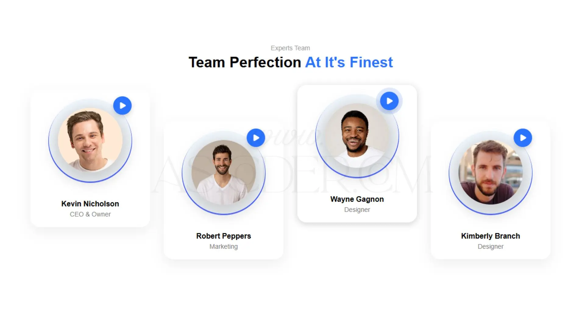
This HTML/CSS code creates a modern and visually appealing "Team Section" for a website. It is perfect for showcasing team members, their photos, names, and roles in an elegant and professional way. The design includes circular profile images, smooth hover effects, and a stylish play button for potential video introductions or profile pop-ups.
Where It Can Be Used:
Company websites to introduce staff and management.
Agency or startup pages to highlight team expertise.
Personal portfolios to show collaborators or partners.
Event pages to display speakers or special guests.
Educational websites to present faculty or mentors.
Key Features:
Responsive Layout: Works well on both desktop and mobile devices.
Modern Design: Rounded profile images with shadow effects for a premium look.
Hover Animation: Smooth hover lift effect for interactive feel.
Video/Link Ready: Play button placeholder to connect videos or profile links.
Customizable: Easy to change colors, images, and roles to match your branding.
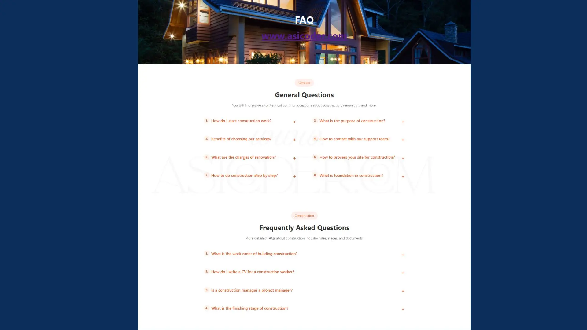
A clean, responsive, and interactive Construction FAQ Section built using HTML, CSS, and JavaScript. This component allows you to present frequently asked questions with expandable answers, making it perfect for construction company websites, contractor portfolios, and service-based landing pages.
The design includes numbered questions, smooth hover effects, and mobile-friendly layouts, ensuring a professional and user-friendly experience.
Key Features:
Responsive grid layout for desktop & mobile.
Expand/collapse answers with smooth toggle.
Numbered question styling for easy readability.
Clean, modern, and construction-themed design.
Fully customizable colors, fonts, and content.
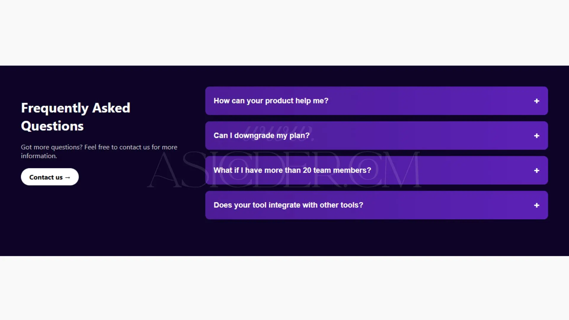
This Responsive FAQ Section is a modern, dark-themed component built with HTML, CSS, and JavaScript. Perfect for SaaS, product landing pages, and business websites, it provides a clean and interactive way to present frequently asked questions.
With a two-column layout, it features a left panel for an introduction and call-to-action, and a right panel with collapsible question-and-answer cards. The design includes smooth toggle functionality, ensuring an elegant user experience on desktop and mobile devices.
Dark mode aesthetic for a premium look.
Fully responsive layout with flexible columns.
Expandable/Collapsible questions with smooth transitions.
Call-to-Action (CTA) button for lead generation.
Customizable colors, fonts, and content.
Easy integration into existing projects.
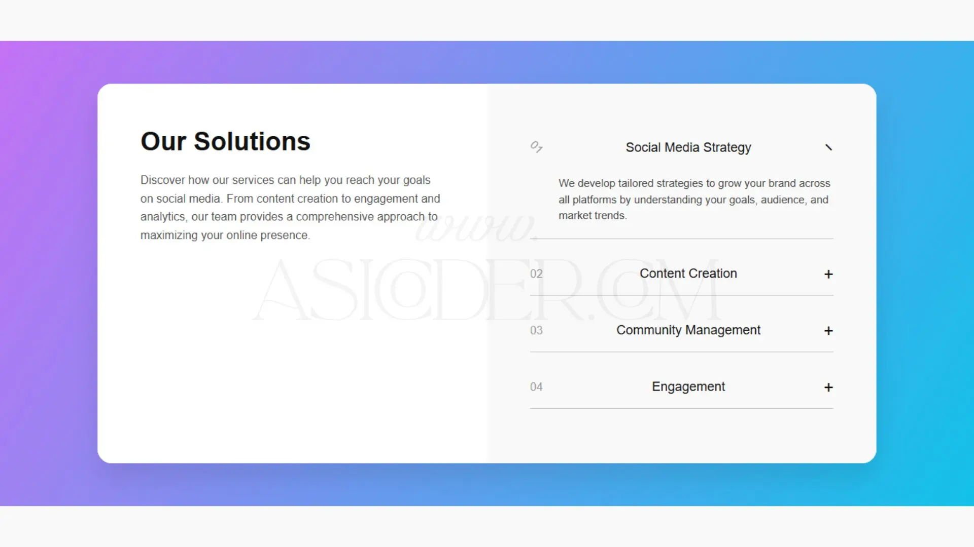
This Responsive Our Solutions Section is a modern, two-column accordion layout built with HTML, CSS, and JavaScript. Designed for service-based businesses, agencies, and SaaS websites, it showcases services in an engaging and organized format.
The left panel introduces your offerings with a clean headline and description, while the right panel features an interactive accordion where each solution expands on click. This design ensures easy navigation, mobile responsiveness, and a visually appealing presentation.
Two-column responsive layout for desktop and mobile.
Accordion functionality for expanding/collapsing details.
Gradient background section for modern aesthetics.
Customizable content for various industries.
Clean typography with a professional feel.
User-friendly interactivity with smooth animations.
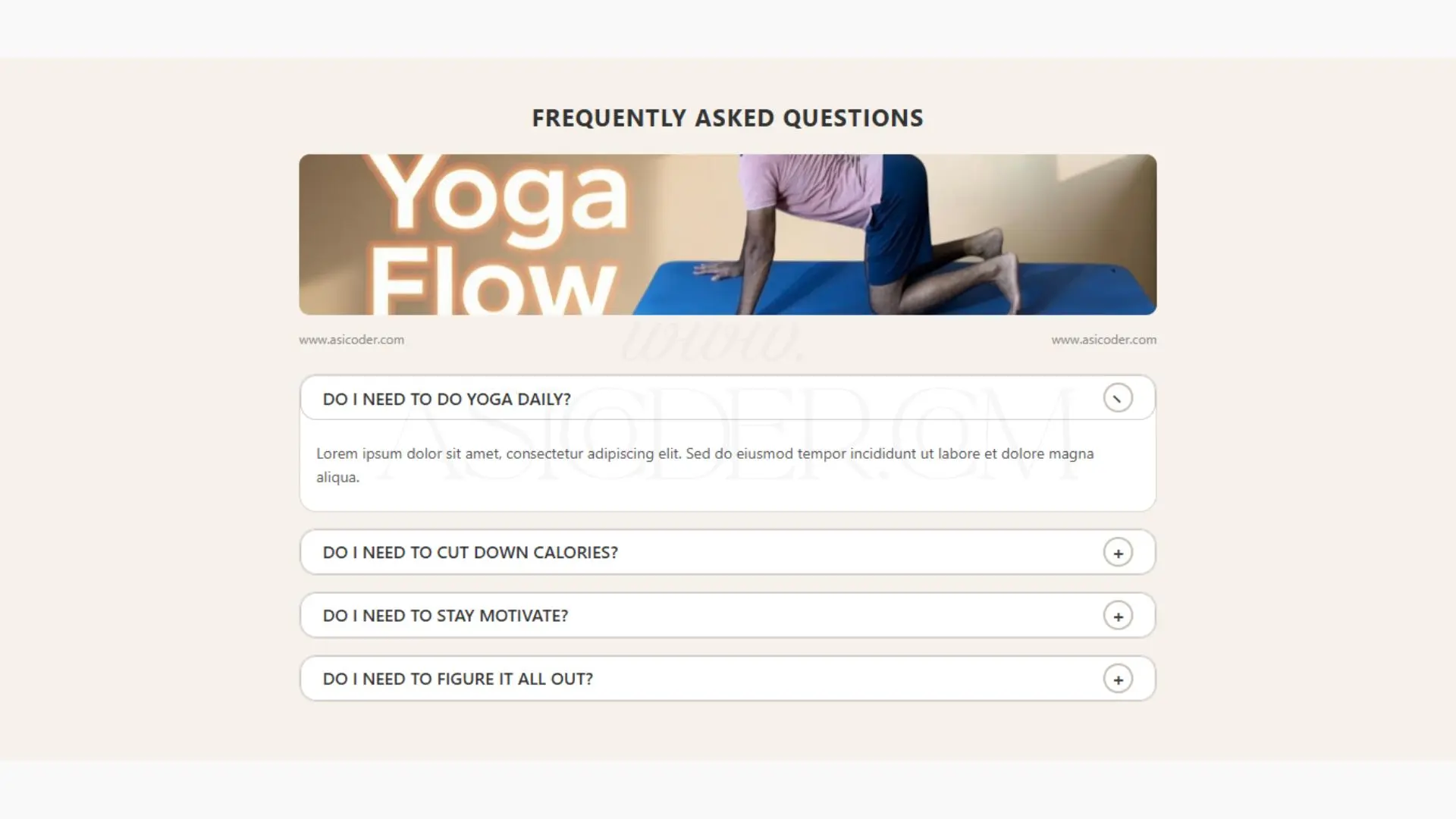
This Responsive Yoga FAQ Accordion is a clean and minimal web component designed to answer common questions in an interactive way. Built using HTML, CSS, and JavaScript, it features a modern accordion layout with smooth toggle animations. Perfect for yoga instructors, wellness coaches, fitness websites, and health blogs, this component improves user experience and engagement.
Its mobile-friendly design ensures that your visitors can access answers anytime, anywhere. The customizable structure makes it easy to adapt for any niche beyond yoga.
Responsive design for desktop and mobile devices.
Interactive accordion for expanding/collapsing FAQs.
Minimalist and clean styling for a professional look.
Customizable content for any fitness, wellness, or educational website.
Image header option to visually enhance the section.
SEO-ready structure for better search engine visibility.
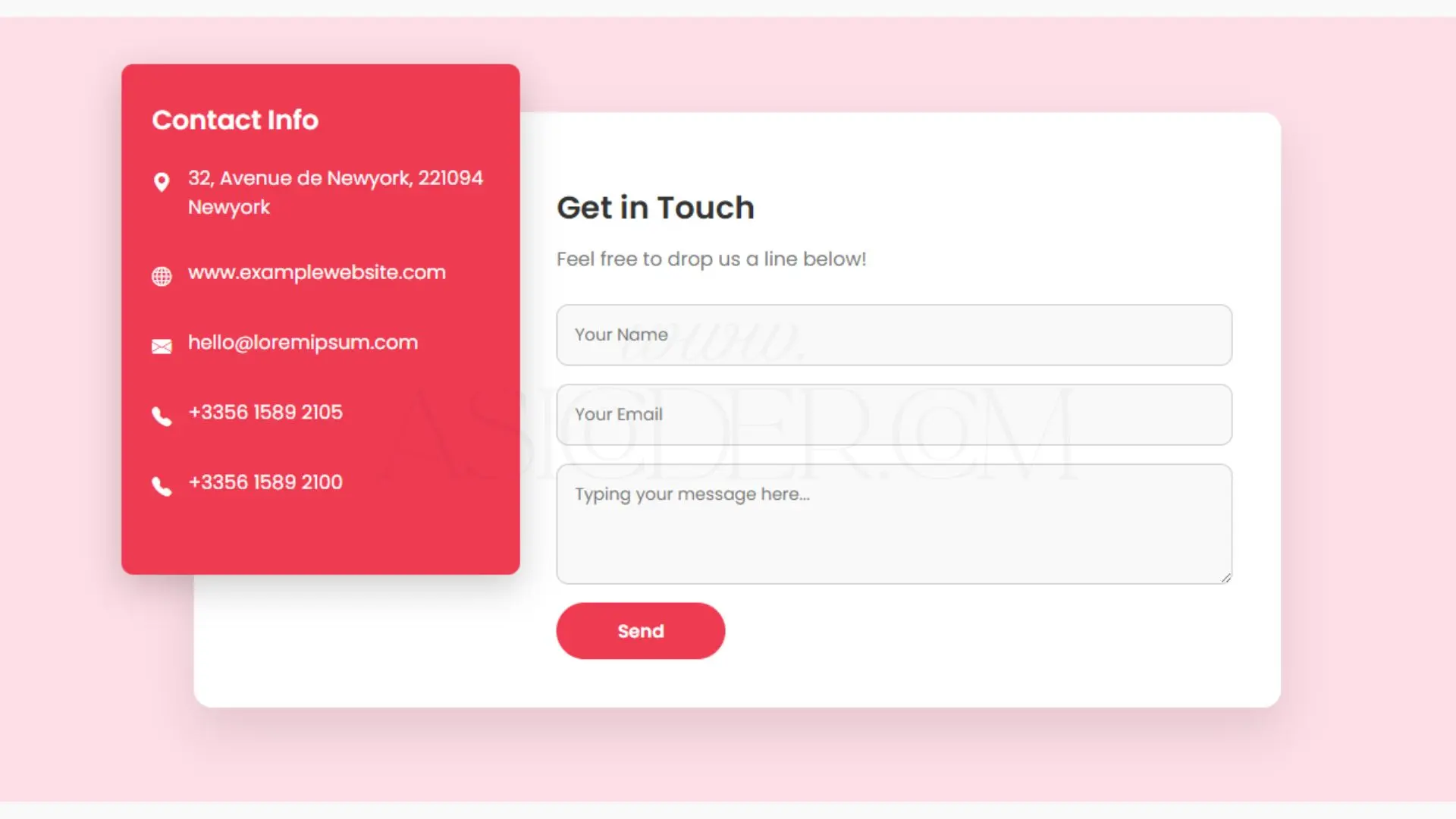
This Responsive Stylish Contact Form is a beautifully designed and mobile-friendly web form built with HTML, CSS, and Bootstrap Icons. Featuring a modern split-layout with a contact information card and a functional message form, it’s perfect for business websites, portfolios, and service landing pages.
The form includes smooth animations, a vibrant accent color, and user-friendly input styling for an enhanced experience. Fully responsive, it adapts seamlessly to desktop, tablet, and mobile devices.
Responsive design for all screen sizes.
Modern split layout with contact info & form side by side.
Bootstrap Icons integration for professional iconography.
Smooth animations with fade-in and slide-in effects.
Customizable fields for name, email, and message.
Hover effects for buttons.
Clean, well-structured HTML & CSS for easy customization.
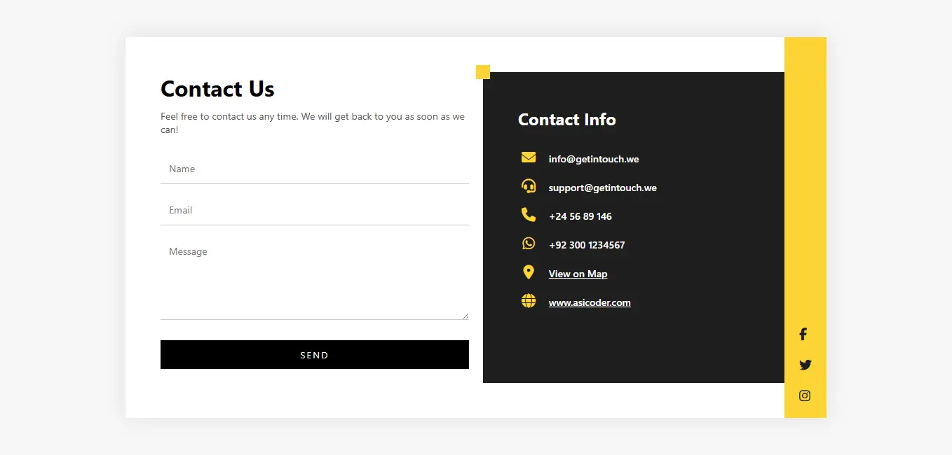
The Modern Contact Us Form Template is a stylish, highly functional, and mobile-friendly solution designed to enhance communication between you and your website visitors. Its clean, minimalistic design ensures it blends seamlessly into any type of website, whether it’s for a business, portfolio, startup, service provider, or personal brand.
This template is carefully crafted with a dual-column layout, placing the contact form on one side and essential contact information on the other. The bold yellow branding elements add a vibrant and eye-catching touch, making your “Contact Us” section both professional and memorable.
Key highlights include:
Integrated contact details with recognizable icons for quick and easy access to email, phone, and address.
Dedicated social media links in a visually appealing sidebar, encouraging visitors to connect across platforms.
User-friendly form fields for name, email, and message, ensuring a smooth communication experience.
Responsive design that adapts flawlessly to mobile devices, tablets, and desktop screens.
Modern typography and spacing for better readability and aesthetics.
Whether you are aiming to generate leads, receive customer feedback, or provide quick support, this template offers a perfect blend of style and functionality. Its clear structure, professional look, and responsive design make it a valuable addition to any website looking to boost engagement and accessibility.
.webp)
The Custom Animated 404 Error Page by AsiCoder is a modern, eye-catching, and fully responsive template designed to turn boring “Page Not Found” errors into an engaging user experience. Built with clean HTML and CSS, this template features a dynamic multi-color gradient background, a floating moon animation, and flickering 404 text that instantly grabs attention.
Perfect for web developers, designers, and website owners, this page ensures visitors don’t leave frustrated when they encounter a broken link. Instead, it offers them a visually appealing layout with a clear call-to-action button guiding them back to the home page.
Key Features:
Animated Gradient Background – Smooth color transitions for a modern look
Floating Moon Effect – Unique visual element that adds style
Flickering 404 Text Animation – Draws user attention instantly
Fully Responsive Design – Looks perfect on desktops, tablets, and smartphones
Fast Loading – Clean and optimized HTML/CSS for better performance
Interactive Home Button – Helps users easily navigate back to the site
Easy to Customize – Change colors, animations, and text with minimal coding
Whether you’re building a personal portfolio, e-commerce store, or corporate website, this 404 error page adds a professional touch and improves user engagement, reducing bounce rates while keeping visitors connected to your brand.
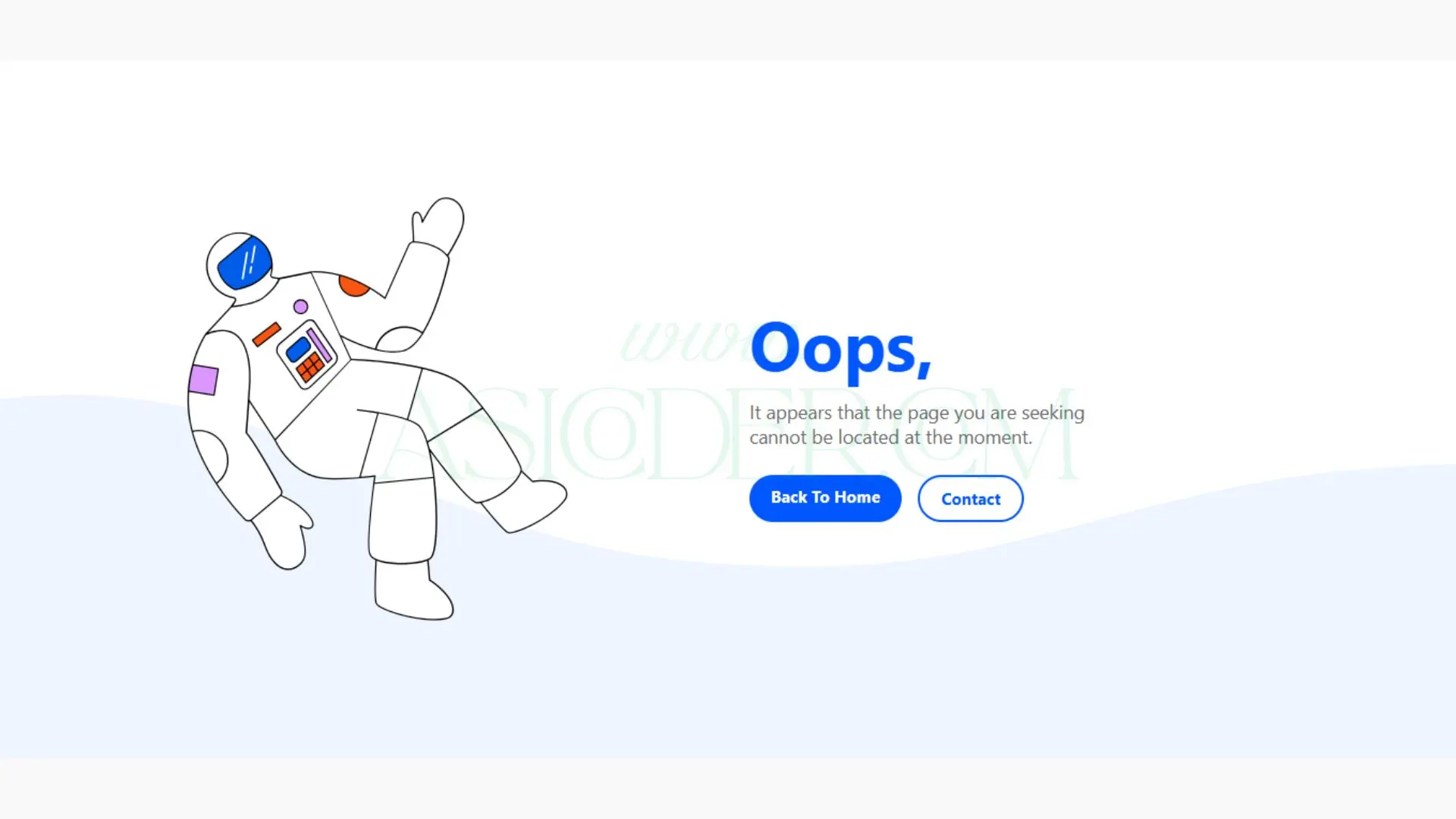
The Responsive AsiCoder-Themed 404 Error Page is a clean, modern, and mobile-friendly template designed to turn a frustrating “Page Not Found” moment into a visually appealing experience. This layout features a two-column design — with an AsiCoder image on one side and a clear message with navigation buttons on the other.
Key Features:
AsiCoder Branding – Unique and professional design for brand identity
Fully Responsive – Adapts seamlessly to mobile, tablet, and desktop screens
Modern Layout – Split content for balanced visuals and readability
Clear Call-to-Action Buttons – “Back to Home” and “Contact” links to keep users engaged
Easy Customization – Change colors, images, and text easily with clean HTML & CSS
Fast Loading – Lightweight code for smooth performance
Perfect for business websites, portfolios, blogs, and e-commerce sites, this 404 error page helps maintain AsiCoder’s professional brand image while guiding lost visitors back to your main content.
Be the first to know. Subscribe today and unlock exclusive deals!
Working Days / Hours!
Free support line!
Orders Support!